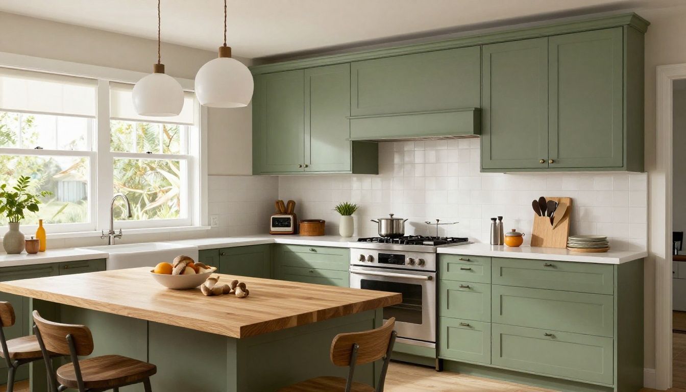
Kitchen Cabinet Colours for 2026: What Is Replacing All-White
Choosing the wrong kitchen cabinet colour can leave you with a $15,000–$35,000 replacement decision several years earlier than planned. That range reflects a typical Vancouver or Calgary cabinet package, before counters, appliances, demolition, and installation; the final figure moves with kitchen size, material, hardware, and site conditions. The practical answer is not that white has disappeared. Warm whites, natural wood, muted greens, mushroom, taupe, and carefully used dark colours are taking its place because they tolerate changing light and connect more reliably with floors, counters, and millwork.
Key takeaways
- The most durable kitchen cabinet colours for 2026 are warm white, mushroom, muted green, natural oak, and restrained charcoal.
- Low winter light in British Columbia favours warm, medium-value colours; bright Alberta light can support deeper tones but exposes glare and undertones.
- Use dark or saturated colours on a controlled area, such as lowers or an island, unless the room has strong daylight and balanced lighting.
- Matte finishes hide fingerprints poorly on dark doors, while textured woodgrain and mid-tone colours are generally more forgiving.
- For resale, choose a quiet cabinet colour for the main run and reserve stronger colour for a replaceable or visually contained element.

Image brief: A realistic professionally photographed contemporary Vancouver kitchen showing mushroom taupe lower cabinets, natural oak uppers, and a muted sage island, soft winter daylight, no people, architectural interior photography.
Which kitchen cabinet colours are replacing all-white in 2026?
Warm neutrals and restrained natural colours are replacing stark white as the default direction. The shift is practical rather than purely fashionable: blue-white finishes can make a shaded room feel cold, while a warm neutral accommodates timber floors, stone counters, aged brass, and black or bronze hardware with less visual conflict.
The strongest kitchen cabinet colour ideas fall into six families:
- Warm white: A creamy or slightly greyed white without a yellow cast. It remains the safest light option, particularly for smaller kitchens.
- Mushroom and taupe: Mid-light neutrals with brown, grey, or mauve undertones. These conceal everyday marks better than bright white and sit comfortably beside oak.
- Muted green: Sage, eucalyptus, olive, and grey-green. These provide colour without the visual weight of emerald or forest green.
- Natural oak and other wood tones: Clear-finished white oak, rift-cut oak, and lightly smoked oak add variation through grain rather than pigment.
- Dusty blue and blue-grey: More controlled than navy, especially useful on an island or a bank of lowers.
- Charcoal and softened black: Effective as an accent, but demanding in lighting, cleaning, and sample approval.
The colours that date fastest are not necessarily the boldest. A highly specific blue, green, or beige tied to a short-lived paint trend can become difficult to coordinate once counters, flooring, or appliances change. Strong colour is less risky when it appears on an island, pantry wall, or furniture-style section rather than every cabinet in the room.
For more context on how colour affects perceived room size, warmth, and visual weight, read this guide to cabinet colour psychology.
How does Vancouver light change the right cabinet colour?
In many Vancouver and Lower Mainland homes, the problem is insufficient direct daylight, not excessive brightness. North-facing windows, tree cover, overcast winter skies, and compact lots can reduce the amount of warm light reaching the cabinet surface. A colour that looks clean in a showroom with 4000K lighting may read blue, grey, or dull at home.
For low British Columbia winter light, start with colours in the light-to-medium value range and warm or balanced undertones. Warm white, pale mushroom, light oak, and soft sage usually perform better than blue-grey, violet-grey, or very dark brown across a long, shaded wall.
That does not mean dark cabinetry is excluded. It means the room needs compensation: under-cabinet lighting, ceiling fixtures that distribute light across work surfaces, and enough contrast between the cabinet colour and the counter. A charcoal cabinet beside a similarly dark stone counter can become one uninterrupted mass after sunset.
Test samples in three conditions:
- Beside the counter and flooring during daylight.
- Under the intended artificial lighting in the evening.
- Against the backsplash and wall colour after those materials are selected.
A sample should be large enough to judge its undertone. A 50 mm chip is not sufficient for a full-height pantry wall; use a door-sized sample or a representative finish panel where possible.
How does bright Alberta light change cabinet colour choices?
Bright Alberta light supports deeper and cooler cabinet colours, but it also reveals glare, uneven sheen, dust, and strong undertones. In Calgary, a dark green may look grounded in a north-facing room and almost black beside a south-facing window. A white with a yellow undertone can become noticeably cream in direct afternoon sun.
For bright Alberta interiors, medium-value greens, blue-greys, natural oak, and neutral whites can all work. The key is controlling reflectance and contrast. High-gloss white reflects hard light and can produce glare across a large run; a low-sheen lacquer or textured wood surface is usually easier to live with.
Large windows also make colour shifts visible through the day. A north-facing room tends to cool the appearance of a finish, while direct south or west light intensifies warmth. If the kitchen connects to a living area, assess the sample from the adjacent room as well. Cabinets are not viewed only from the sink.
The local climate also affects maintenance planning. Dry winter heating can make dust more apparent on dark doors, while a busy kitchen still produces grease deposits regardless of location. The finish must be selected with cleaning habits in mind, not just daylight.
Should uppers and lowers be the same colour?
Use the same colour on all cabinets when the room benefits from visual continuity or when the layout is already busy. Use two colours when you need to reduce the perceived height of a tall run, anchor an island, or separate a kitchen from an adjoining living space.
The most reliable two-tone arrangements are:
- Warm white uppers with mushroom, olive, or natural oak lowers.
- Natural oak uppers with muted green or taupe lowers.
- One light cabinet colour throughout with a darker island.
- A single dark pantry or appliance wall balanced by lighter perimeter cabinets.
Avoid choosing two colours that differ only slightly in value but have different undertones. A warm beige upper beside a pink-grey lower can look accidental rather than layered. If the colours are close, make the material or sheen clearly different; if the materials are similar, create enough value contrast to make the division intentional.
The complete two-tone cabinet pairing guide covers proportion, undertones, and combinations in greater detail.
| Pairing | Where it works | Main risk | Practical control |
|---|---|---|---|
| Warm white uppers / oak lowers | Smaller or shaded rooms | Can feel visually top-heavy if the uppers are too bright | Repeat the oak in shelving or flooring |
| Mushroom uppers / muted green lowers | Traditional, transitional, and contemporary kitchens | Green may turn grey in weak light | Test beside the backsplash under evening lighting |
| White perimeter / dark island | Open-plan rooms needing a focal anchor | Island can look heavy | Keep the island finish matte and maintain clear circulation |
| Oak uppers / taupe lowers | Rooms with timber floors and natural materials | Too many wood tones can compete | Keep undertones consistent and limit species |
| Light perimeter / charcoal pantry wall | Large kitchens with strong daylight | Dark wall can recede too aggressively | Add direct task lighting and a lighter counter |

Image brief: A clean architectural diagram-style kitchen elevation showing warm white upper cabinets, muted green lower cabinets, a natural oak island, labelled colour zones, neutral background, precise cabinet lines, no readable brand names.
Which finish is practical for dark and matte cabinets?
A dark matte finish is practical if you accept more frequent visible cleaning and specify a durable, repairable surface. Matte does not mean mark-proof. Oils from hands can leave lighter or darker patches on charcoal, navy, and black doors, especially around the pulls and edges.
The material and sheen matter as much as the colour:
- Textured melamine: Often consistent and cost-controlled, with good resistance to everyday wear. Deep textures can trap grease around the profile and are difficult to touch up invisibly.
- Thermofoil: A heat-formed vinyl surface over a fibreboard core. It offers consistent colour and easy cleaning, but heat and steam exposure near dishwashers or ranges must be considered.
- Painted MDF: MDF is medium-density fibreboard, a smooth substrate commonly used for painted doors. It produces clean colour and profiles, but edges and exposed damage require careful repair.
- Wood veneer: A thin layer of real wood over a stable panel. It gives natural variation and can be refinished or replaced by a specialist, but batches and panels will not be perfectly identical.
- Catalyzed lacquer: A chemically cured coating used on many high-quality painted or wood surfaces. It can provide a durable, consistent finish, but colour matching and site repairs should be handled by a qualified finisher.
Use a soft cloth and the cleaner approved for the specified finish. Do not assume that a general degreaser, abrasive sponge, or steam cleaner is safe. Around a range, a darker textured surface may hide small splashes but still needs prompt cleaning because oil can build in the texture.
The table below gives planning guidance, not a warranty. Actual performance depends on the product system, door profile, household use, ventilation, and installation quality.
| Finish direction | Visible fingerprints | Typical cleaning expectation | Colour stability concern | Best use |
|---|---|---|---|---|
| Bright white satin | Low to medium | Wipe visible food marks as needed | Yellowing or mismatch if products age differently | Full perimeter in low-light rooms |
| Warm neutral matte | Medium | Regular wipe-down at pulls and work zones | Undertone mismatch with counters | Main cabinet run |
| Dark matte | High | Frequent wipe-down, especially near pulls | Shows chips and sheen variation | Island or contained accent |
| Textured woodgrain | Low to medium | Clean grooves and edges carefully | Panel-to-panel grain variation | Large runs and family kitchens |
| High-gloss colour | Medium to high | Frequent cleaning to control glare and smears | Reflects surrounding colours strongly | Small, well-lit areas |

Image brief: Realistic close-up product photograph of a matte charcoal cabinet door with a simple integrated pull, subtle fingerprints near the opening edge, soft cloth nearby, neutral workshop lighting, accurate material texture, no people.
How should cabinet colour work with counters, floors, and hardware?
Select the cabinet colour with the fixed materials, not in isolation. The counter usually occupies more visible surface than the backsplash and often contains several undertones that determine whether a cabinet reads green, beige, pink, or grey.
A practical sequence is:
- Confirm the floor and countertop direction.
- Shortlist cabinet families that share an undertone with those materials.
- Choose the backsplash after the cabinet and counter relationship works.
- Select hardware based on the combined palette and the door profile.
- Check all samples in daylight and artificial light.
Natural oak cabinets pair well with counters that have restrained veining and warm or neutral undertones. Mushroom and taupe can work with stone-like counters, but pink or mauve undertones need to be deliberately matched. Muted green is often more forgiving with timber and white counters than with busy, blue-veined stone.
Hardware should not be used to rescue a weak colour combination. Brass warms a cool scheme but can exaggerate yellow undertones; black hardware creates sharper contrast and shows dust; stainless steel is neutral but can make a warm palette feel more utilitarian. The decision should follow the cabinet sample, not a small finish chip from a showroom board.
For a renovation where layout, cabinet colour, and material coordination need to be resolved together, reviewing an installed kitchen and bath renovation portfolio can help you judge complete combinations rather than isolated doors.
What cabinet colours are safest for resale?
Warm white, light oak, and quiet taupe are generally the least restrictive resale choices because they leave more options for future wall colours, furniture, and appliances. No cabinet colour guarantees resale value, and the quality of the layout, installation, storage, and maintenance will usually matter more than a precise shade.
A good resale strategy is to keep the permanent, expensive-to-change surfaces restrained. Cabinet colour can still have character, but place the stronger decision on a painted island, a replaceable backsplash, or furniture that can be changed without rebuilding the full kitchen.
For a long-term home, resale should not eliminate every personal choice. It should prevent a colour from creating a coordination problem with the rest of the house. A full run of saturated cobalt, for example, demands compatible counters, walls, floors, and lighting for the entire service life of the cabinets.
How is a cabinet colour actually selected and built?
Colour approval is only one part of cabinet fabrication. The shop must also confirm the substrate, edge treatment, door construction, sheen, hardware drilling, and how adjacent panels will meet on site.
For a painted kitchen, the sequence normally includes panel preparation, machining, sanding, priming, finish application, curing, inspection, and packing. Door profiles and routed edges can absorb or reflect colour differently from flat panels. A dark colour makes uneven sanding, edge damage, and inconsistent sheen easier to see.
For veneer or wood, the shop selects and sequences panels so grain direction and tone are controlled across doors and end panels. Natural variation is part of the material; it cannot be eliminated by selecting a digital colour from a screen. Appliance panels, fillers, toe kicks, and finished ends must be considered at the same time so the colour does not stop abruptly at exposed areas.
A site can also change the result. Walls may not be square, floors may vary in height, and existing openings may require fillers or scribes. A scribe is a fitted strip that closes an irregular gap between cabinetry and a wall. It is normally finished to match the adjacent cabinet, making accurate colour and sheen consistency important.
An illustrative scenario: a homeowner selects a near-black matte island from a small showroom chip and approves it under bright overhead lighting. Once installed beside a dark counter, the island reads as a single block and shows every hand mark. A larger sample viewed at home would not remove the preference for dark colour, but it would reveal the need for a lighter counter and a lower-sheen, textured surface.

Image brief: Detailed technical cutaway illustration of a custom kitchen cabinet door and box, showing painted finish, MDF door panel, plywood cabinet box, edge banding, hinge, adjustable shelf pin, and wall attachment, clean professional cabinetry diagram, muted neutral colours, no brand labels.
What should you budget for a colour change?
A colour decision is cheapest before fabrication and most expensive after installation. Changing a selected colour before production may involve only revised samples or a finish adjustment. Changing it after doors and panels are made can mean refinishing, replacement, transport, and reinstallation; painted doors may not match perfectly after repair.
For rough Canadian planning, a small sample review may cost tens to a few hundred dollars depending on whether custom finishing is required. Refinishing an existing kitchen can range from several thousand dollars for a limited, accessible set of doors to well over $10,000 for a large kitchen with removal, repairs, spraying, and reinstalling. Full replacement commonly moves into the $15,000–$35,000 or higher range for cabinetry alone in a custom renovation. These are planning ranges, not quotations.
| Decision point | Typical time impact | Cost direction | What moves it higher |
|---|---|---|---|
| Change colour before shop drawings are approved | 1–7 days | Low | New custom sample or revised finish schedule |
| Change colour after sample approval but before production | 1–3 weeks | Low to moderate | Rework, new sample, production slot |
| Refinish existing doors | 1–3 weeks on site or in a shop | Moderate | Door repairs, profiles, removal, transport, spray access |
| Replace doors and retain cabinet boxes | 3–8 weeks | Moderate to high | New hinges, end panels, fillers, damaged boxes |
| Replace full custom cabinet package | 8–16+ weeks | High | Complex layout, specialty finishes, site access, lead times |

Image brief: Professional cabinetmaker’s worktable with large painted and wood veneer door samples in warm white, mushroom, sage, oak, and charcoal beside countertop slab samples, flooring, backsplash tile, and hardware, natural daylight, precise and realistic.
How do you make a final colour decision without guessing?
Order or produce large samples, label their orientation, and leave them in the room for at least one full day. Look at them in morning, afternoon, evening, and under the final lighting temperature. If the kitchen is still at the design stage, temporary lighting can give a false result, so note that limitation.
Keep the shortlist to two or three cabinet families. Compare the same counter and backsplash with each option, rather than comparing unrelated complete mood boards. Ask the cabinetmaker how the finish will be applied, how exposed ends will be matched, and what cleaning products the manufacturer permits.
In Vancouver, give particular attention to shadowed corners and winter daylight. In Calgary, inspect areas receiving direct sun and consider how the colour will look when the room is bright. A good colour is one that remains acceptable across those conditions, not one that wins a single photograph.
If the project includes unusual dimensions, integrated appliances, or a difficult existing space, a design review with a shop that handles both fabrication and installation can prevent colour choices from being separated from construction decisions. Final Draft Cabinetry provides custom kitchen and bathroom design services for projects in the Vancouver, Burnaby, and Calgary markets.
FAQ
Are white kitchen cabinets out of style in 2026?
No. Stark blue-white is losing ground, but warm white remains a dependable cabinet colour. It works in smaller rooms, reflects available light, and is easier to coordinate for resale. The important distinction is undertone: compare the proposed white with the counter, flooring, backsplash, and evening lighting before approving it.
What is the most popular kitchen cabinet colour for resale?
Warm white, light natural oak, and restrained taupe are among the safer resale directions. They do not guarantee a return because layout, workmanship, storage, and maintenance carry substantial weight. Keep stronger colours to an island or contained section if you want personality with less impact on the full renovation.
Do dark kitchen cabinets make a room look smaller?
They can, particularly when the walls, counter, and floor are also dark or when daylight is limited. Dark lowers with light uppers can anchor a room without enclosing it visually. Strong task lighting, adequate contrast, and a large sample are needed before using charcoal, navy, or black across a full cabinet run.
Is matte or satin better for kitchen cabinets?
Satin is usually easier to maintain visibly because it reflects enough light to reduce the appearance of hand oils and can be wiped more predictably. Matte can provide a quieter appearance but shows fingerprints and sheen changes more readily on dark colours. The coating system and cleaning instructions matter as much as sheen.
How long will a painted cabinet colour stay current?
A well-made finish can remain serviceable for many years, but style has no fixed expiration date. Warm neutrals, natural wood, and muted colours usually age more quietly than highly saturated trend colours. Good fabrication, ventilation, careful cleaning, and avoiding heat or moisture damage will matter more than the year the colour was selected.
Should I choose cabinet colour before the countertop?
Choose them as a coordinated pair, but confirm the countertop direction first if it is already selected or difficult to change. Counters often contain several undertones and occupy substantial visual area. A cabinet sample viewed beside the actual slab or a faithful large sample is more reliable than a digital rendering.
Final recommendation
The best kitchen cabinet colours for 2026 are not defined by a single trend. Warm white, mushroom, muted green, natural oak, and controlled charcoal each work when their undertones, finish, daylight, and surrounding materials are addressed before fabrication. For most Vancouver and Calgary renovations, keep the main cabinet run quiet, use stronger colour where it has a clear boundary, and approve a large sample in the actual room. If the layout or finish carries a meaningful cost, bring in a custom cabinet shop before the colour is locked.