
Beyond the Island: Mastering Two-Tone Cabinetry for Depth and Drama in 2026
Beyond the Island: Mastering Two-Tone Cabinetry for Depth and Drama in 2026
We’re looking at how to use two colors on kitchen cabinets in 2026. It’s a way to add more interest and a custom feel to your kitchen. Instead of just one color everywhere, we can play with different shades and placements to make the space feel more dynamic. This approach goes beyond just the kitchen island and can really change the whole look and feel of the room. We’ll explore some popular combinations and how to make them work in your home.
Key Takeaways
- Using two different cabinet colors, often called two-tone cabinetry, is a major trend for kitchens in 2026, adding depth and personality.
- Popular pairings include classic combinations like navy and white, and more modern choices such as charcoal and light gray, or forest green with natural wood.
- The placement of colors matters; for instance, using a bold color on the island while keeping perimeter cabinets neutral can create a strong focal point.
- Hardware, finishes, countertops, and lighting all play a significant role in making a two-tone cabinet design look cohesive and intentional.
- Testing physical samples in your actual kitchen space is vital to ensure the chosen colors work well with your home’s lighting and existing elements.
Embracing the Two-Tone Trend: A Sophisticated Palette for 2026
We’re seeing a significant shift in kitchen design as we move into 2026, and the two-tone cabinetry trend is at the forefront of this evolution. It’s a sophisticated approach that moves beyond the predictable, offering a way to inject personality and depth into what is often the heart of our homes. This trend isn’t just about slapping two colors on your cabinets; it’s about creating a visual narrative, a carefully curated look that feels both intentional and deeply personal.
The Allure of Contrasting Cabinetry
The appeal of two-tone cabinetry lies in its ability to break free from monochromatic monotony. Instead of a single, uniform color, we have the opportunity to play with contrast, creating visual interest and defining different zones within the kitchen. Think of it as a conversation between colors, where one hue might ground the space while another adds a touch of lightness or drama. This approach allows for a more dynamic and engaging kitchen environment, moving away from the sterile feel that some single-color schemes can sometimes impart. It’s a way to make a statement without being overwhelming, offering a fresh alternative to traditional designs [7022].
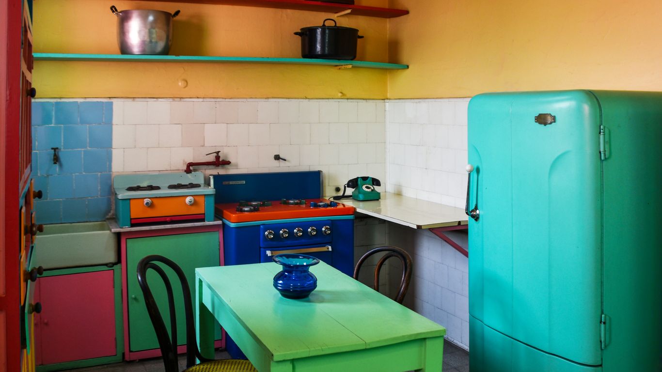
Beyond the Island: A Deeper Dive into Two-Tone Kitchen Cabinet Trends
While the kitchen island has often been the star of the two-tone show, the trend is expanding. We’re now seeing more creative applications across the entire kitchen. This might involve pairing darker, grounding colors on the lower cabinets with lighter shades on the uppers, creating a sense of spaciousness and airiness. Alternatively, a bold color might be reserved for a specific section, like a pantry wall or a dedicated baking station, adding a surprising pop of personality. The key is thoughtful placement, using color to guide the eye and define functional areas.
Crafting Your Kitchen’s Narrative with Color
Choosing your two-tone palette is akin to selecting the chapters of a story. Do you want a calm, serene atmosphere, or something more vibrant and energetic? The colors we select have a profound impact on how a space feels. For 2026, we’re seeing a move towards warmer, earthier tones that create a sense of comfort and grounding. Think creamy caramels, rich terracotta, and deep olive greens, often paired with softer whites or natural wood finishes. These palettes offer a sophisticated warmth that feels both inviting and timeless [a688].
Here are some popular pairings we’re observing:
- Warm Neutrals & Deep Accents: Creamy beiges or soft whites paired with a deep charcoal or a rich navy. This offers a classic yet modern feel.
- Earthy Tones & Natural Wood: Sage greens or muted rusts complemented by the natural grain of wood cabinets. This brings an organic, grounded luxury to the space.
- Bold Statements & Soft Backdrops: A vibrant teal or a deep forest green used strategically, balanced by crisp white or light gray cabinetry. This creates a focal point without overwhelming the senses.
The careful selection of colors for your kitchen cabinetry is more than just an aesthetic choice; it’s about setting a mood and reflecting your personal style. We are moving towards palettes that feel lived-in and authentic, creating spaces that are both beautiful and deeply comfortable.
Timeless Pairings for Enduring Elegance
Navy Blue and Crisp White: A Classic Foundation
When we think of enduring kitchen styles, the combination of navy blue and crisp white immediately comes to mind. It’s a pairing that feels both classic and current, offering a sophisticated foundation for any home. We often see navy used on lower cabinets, grounding the space with its depth, while white takes the upper cabinets, keeping the kitchen feeling bright and open. This contrast creates a visual hierarchy that’s pleasing to the eye.
- Hardware Selection: Warm metals like brass or polished gold handles and pulls really pop against the deep navy. They add a touch of luxury and warmth, preventing the scheme from feeling too cool. We find this detail makes a significant difference.
- Backsplash Choice: A classic white subway tile backsplash is an excellent choice to bridge the gap between the navy lowers and white uppers. For a more modern twist, consider a white marble slab or a geometric patterned tile with hints of blue.
- Lighting is Key: Ensure your kitchen has ample natural and artificial light. Good lighting is crucial to bring out the rich undertones of the navy paint; poor lighting can make it appear black or dull.
This approach provides a powerful pop of color without committing to a full two-tone wall. It’s a way to introduce drama while maintaining an airy feel.
Sage Green and Cream: Organic Serenity
A soothing and nature-inspired choice, the sage green and cream kitchen cabinet color combination brings an organic, calming warmth into the heart of the home. This earthy palette pairs muted, dusty green cabinets with warm cream or soft off-white walls and accents. The result is a kitchen that feels both sophisticated and grounding, offering a gentle alternative to stark white while maintaining a light and airy atmosphere. It’s a palette that truly connects us to the outdoors, creating a serene retreat.
Warm Beige and Soft White: A Gentle Embrace
For those seeking a serene and sophisticated neutral palette, the combination of warm beige and soft white offers an effortlessly elegant solution. This pairing moves beyond stark white, creating a kitchen with inviting warmth and a spa-like tranquility. Typically, this involves warm beige or “greige” cabinets complemented by soft white walls, countertops, or a contrasting island, resulting in a layered, monochromatic look that is both modern and timeless. Its subtlety allows architectural details and material textures to take center stage, creating a space that feels calm, curated, and expensive. We love how this combination feels so intentionally designed, offering a beautiful, high-end foundation that appeals to a wide audience. It’s a look that feels both current and enduring, a true testament to the power of thoughtful neutrals. For more insights on enduring color choices, you can explore the latest in kitchen cabinet color trends.
Modern Monochromes and Bold Statements
While serene palettes have their place, sometimes a kitchen calls for a bit more drama. For 2026, we’re seeing a move towards more assertive color choices that still feel sophisticated and grounded. This isn’t about shouting with color, but rather using it to create a strong, memorable impression.
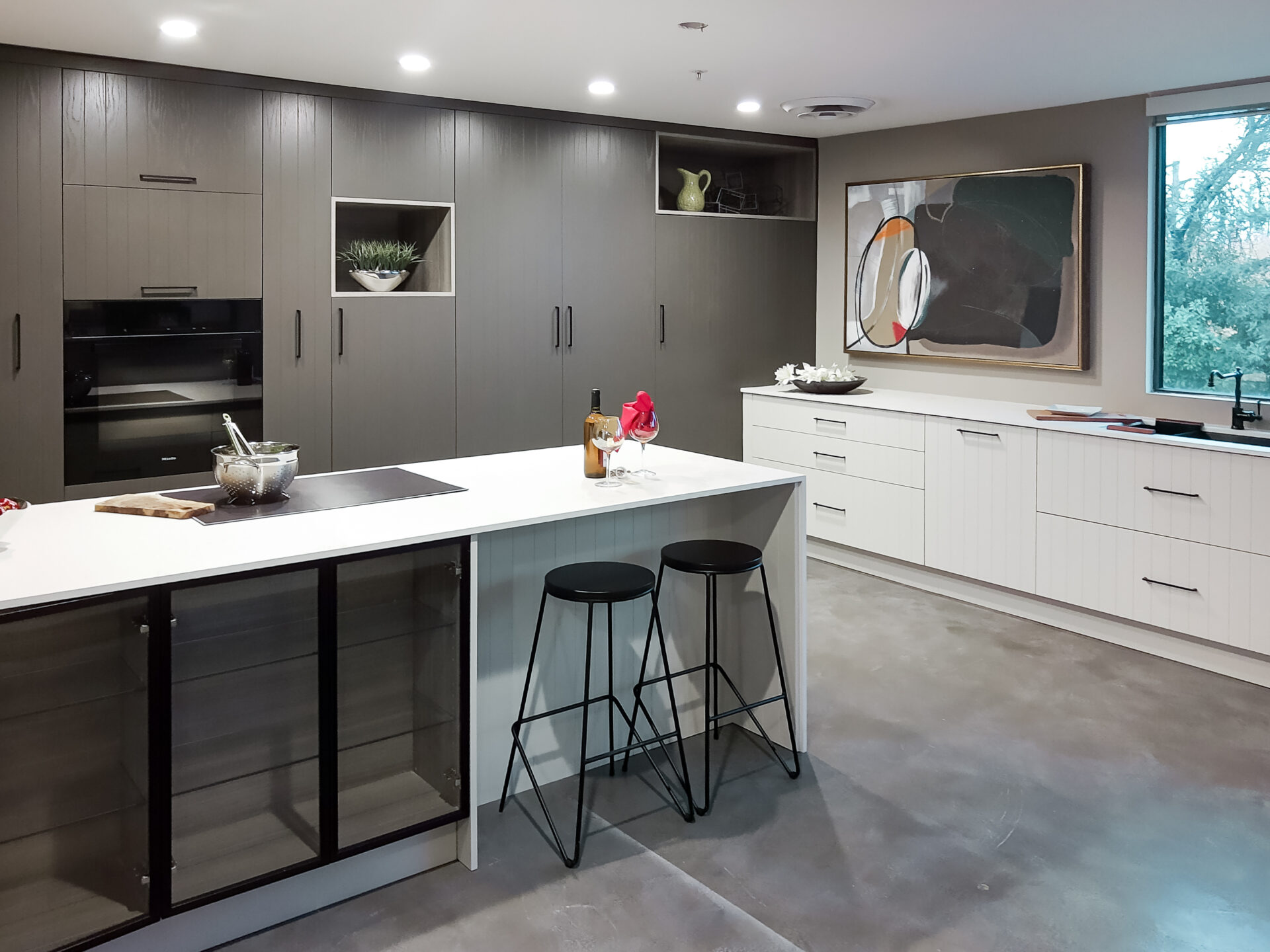
Charcoal Gray and Light Gray: Sleek Urban Sophistication
For a look that feels undeniably modern and effortlessly chic, the charcoal gray and light gray combination really delivers. We often see deep, moody charcoal on the lower cabinets, paired with a softer, lighter gray on the uppers. This layering of tones creates a sense of depth and dimension without relying on stark color contrasts, resulting in a sleek and unified aesthetic. It’s a hallmark of contemporary design, frequently seen in urban settings and minimalist homes. The refined elegance here allows other design elements, like high-end appliances or a dramatic countertop, to take center stage. To keep this look from feeling too cool, we like to introduce warmth through natural wood elements, perhaps in open shelving or a butcher block island top. Hardware in a brushed gold or warm brass finish also provides a striking contrast, adding a touch of luxe warmth and preventing the palette from feeling too industrial. Don’t forget strategic lighting; under-cabinet LEDs can add a soft glow that creates ambiance and highlights your surfaces.
Forest Green and Natural Wood: Grounded Luxury
This pairing brings the richness of the outdoors in, creating a space that feels both luxurious and deeply comforting. Forest green cabinets, especially on the lower sections, offer a dramatic, grounding effect. When paired with natural wood elements – think warm-toned wood for upper cabinets, open shelving, or even a statement island – it creates a sophisticated, intimate feel. This combination is perfect for those who appreciate timeless elegance with a touch of the dramatic. It’s a look that feels collected and lived-in, offering a rich narrative rather than a temporary trend statement. We find that brass hardware works exceptionally well here, adding a warm metallic accent that complements both the deep green and the natural wood tones. This approach gives a home a sense of individuality, depth, and character that a perfectly brand-new space often lacks. Consider this pairing for a kitchen that feels like a cozy, high-end retreat.
Soft Pink and White: A Delicate, Chic Touch
Who says bold has to mean dark? A softer approach to statement-making involves delicate hues like soft pink, especially when paired with crisp white. This combination offers a warm, feminine, and sophisticated feel that’s surprisingly versatile. It’s a way to add personality and warmth without overwhelming the space. The key here is in the subtlety of the pink tone; we’re not talking bubblegum, but rather a muted, almost dusty rose. When used on lower cabinets, with clean white uppers, it creates an inviting and chic atmosphere. This pairing is particularly photo-friendly and can make a kitchen feel like a boutique space. To achieve this look, we recommend quality paint finishes and considering hardware in a warm metal like brass to tie everything together. It’s an elegant choice that adds warmth and personality, moving away from the starkness of purely monochromatic schemes. This is a great example of how kitchen design trends for 2026 are embracing creativity and personal expression.
Achieving Harmony: The Art of Two-Tone Implementation
When we decide to embrace two-tone cabinetry, we’re not just picking colors; we’re orchestrating a visual symphony in our kitchens. It’s about creating a space that feels balanced, intentional, and deeply personal. Getting this right means paying close attention to how the different tones interact and how they play with the other elements in your kitchen.
Balancing Light and Dark Tones
The secret to a successful two-tone kitchen lies in proportion. Think of it like a well-composed photograph – there’s a main subject and supporting elements. We generally recommend a ratio that leans towards one tone, often around 60-40 or 70-30. This prevents either color from becoming too dominant and keeps the space feeling cohesive. For instance, using a darker, richer color on the lower cabinets can ground the kitchen, making it feel more stable, while lighter tones on the upper cabinets can keep the space feeling open and airy. This approach helps to create a sense of depth without making the room feel smaller.
- Darker tones on lower cabinets: Provides a sense of stability and anchors the space.
- Lighter tones on upper cabinets: Creates an illusion of height and openness.
- Consider the room’s natural light: A room with less natural light might benefit from more lighter tones overall.
The goal is to create a visual flow that guides the eye, making the kitchen feel both dynamic and comfortable. It’s about finding that sweet spot where contrast meets cohesion.
The Crucial Role of Hardware and Finishes
Hardware is the jewelry of your kitchen cabinets, and in a two-tone design, it plays an even more significant role. The right choice can tie your two chosen colors together or provide a striking accent. For example, warm metals like brass or gold can add a touch of luxury and warmth, especially when paired with cooler-toned cabinets. Matte black hardware can offer a modern, graphic contrast. We also need to think about the finish of the cabinets themselves. A matte finish can feel more contemporary and subtle, while a high-gloss finish can reflect light and add a touch of glamour. Consistency in finish across both colors is usually best for a polished look, though mixing finishes can be a bold choice for the truly adventurous. For more on how finishes can impact your space, explore creative kitchen cabinet ideas.
Integrating Countertops and Backsplashes
Your countertops and backsplashes are the connective tissue in your two-tone design. They need to harmonize with both cabinet colors. A neutral countertop, like a soft white quartz or a subtly veined granite, can act as a bridge between contrasting cabinet colors. If your cabinets are very bold, a simpler backsplash might be best to avoid overwhelming the space. Conversely, if your cabinets are more subdued, a patterned or textured backsplash can add personality. We often see beautiful results when the backsplash picks up an accent color from one of the cabinet tones, or when a countertop material is used on the island to visually link it to the perimeter cabinets. The key is to ensure these elements don’t compete but rather complement the overall scheme, contributing to a flawless style.
Here’s a quick guide to pairing:
| Cabinet Colors | Recommended Countertop | Suggested Backsplash |
|---|---|---|
| Navy Blue & White | White Quartz, Light Marble | White Subway Tile, Blue Mosaic |
| Sage Green & Cream | Butcher Block, Cream Marble | Zellige Tile, Stone |
| Charcoal Gray & Light Gray | White Quartz, Black Granite | Light Gray Tile, Stainless Steel |
| Soft Pink & White | White Marble, Light Wood | White, Pink, or Gray Tile |
Illuminating Your Two-Tone Masterpiece
The Impact of Lighting on Color Perception
Lighting plays a massive role in how we see colors, and with two-tone cabinets, it’s even more important. What looks like a deep, moody charcoal in one light might appear almost black in another. We need to think about the kind of light we’re using and where it’s coming from. Natural light is fantastic, of course, but most kitchens rely on a mix of ambient, task, and accent lighting. Getting this right means your cabinet colors will always look their best, showing off their intended depth and contrast. It’s not just about brightness; it’s about the quality and color temperature of the light.
Strategic Placement for Ambiance and Function
Think about how you use your kitchen. We need task lighting directly over work surfaces – think under-cabinet lights that shine down on your countertops. This is where you’ll be chopping, prepping, and cooking, so good, clear light is a must. Then, we have ambient lighting, which fills the room with a general glow, often from ceiling fixtures. Finally, accent lighting can highlight specific features, like a beautiful backsplash or decorative shelving. For two-tone cabinets, placing lights strategically can really make the contrast pop. For instance, uplighting can cast shadows that emphasize the texture of darker upper cabinets, while downlighting can keep lower cabinets feeling grounded and accessible. We’ve found that a layered lighting approach works best, giving us control over the mood and functionality of the space.
Highlighting Rich Undertones and Textures
When we choose specific paint colors for our cabinets, they often have subtle undertones – a hint of blue in a gray, or a touch of red in a beige. The right lighting can bring these undertones to life, adding another layer of sophistication to the two-tone effect. Consider how warm light (more yellow) can bring out reddish or yellowish undertones, while cooler light (more blue) can make blues and grays appear more vibrant. We also want to think about texture. If our cabinets have a slight sheen or a wood grain, lighting can play across these surfaces, creating highlights and shadows that add visual interest. It’s about making the cabinets feel dynamic, not flat. We can even use dimmers to adjust the lighting throughout the day, changing the feel of the kitchen from bright and energetic for morning prep to warm and cozy for evening meals. This flexibility is key to truly appreciating the depth of two-tone kitchen design.
We’ve noticed that homeowners who invest in thoughtful lighting solutions often find their two-tone cabinets look more expensive and intentional. It’s a detail that truly transforms the space, making the colors sing and the textures come alive. Don’t underestimate the power of a well-lit kitchen; it’s where the magic happens.
Beyond Color: Enhancing Your Two-Tone Design
While color is certainly the star of the two-tone cabinet show, we mustn’t forget the supporting cast that brings the entire design to life. Think of your cabinet colors as the main melody; now we need to add the harmonies and rhythm. This involves carefully considering the materials, textures, and even the way light plays in your kitchen. It’s about creating a cohesive and layered look that feels intentional and deeply personal.
Material Harmony: Wood, Stone, and Metal
The interplay of different materials can add a surprising amount of depth to your two-tone cabinetry. For instance, pairing a painted cabinet with a natural wood finish can create a beautiful contrast that feels both grounded and refined. We often see this in modern rustic kitchens, where a deep forest green might be complemented by warm, natural wood accents. It’s not just about the cabinet doors themselves, but also how these materials interact with your countertops and flooring. Consider how a sleek, matte black cabinet might pair with a veined marble countertop, or how a soft cream cabinet could be grounded by a rich, dark wood island. These combinations add a tactile dimension that paint alone can’t achieve. The right material choices can make your kitchen feel more grounded and sophisticated, reflecting a sense of timeless appeal.
The Power of Texture in Cabinetry
Texture is another element that can truly make your two-tone design sing. Beyond the smooth finish of painted cabinets, consider incorporating doors with subtle detailing, like shaker-style panels or even a beadboard effect. These small details can catch the light differently and add visual interest, especially when juxtaposed with a sleeker, flat-panel counterpart. For a more dramatic effect, think about incorporating materials with inherent texture, such as rift-sawn oak or a fluted glass insert. These elements add a layer of complexity that invites the eye and makes the cabinetry feel more substantial and thoughtfully designed. Even the finish of your hardware plays a role here; a brushed brass knob will feel different than a matte black pull.
Accessorizing to Complement Your Palette
Finally, let’s talk about the finishing touches. Accessories are where you can really inject your personality and tie your two-tone scheme together. This includes everything from your cabinet hardware to your decorative items. When selecting hardware, consider how it will interact with both cabinet colors. For example, if you have a navy and white scheme, polished nickel or brass hardware can add a touch of polish. If you’re going for a more muted, earthy palette, matte black or oil-rubbed bronze might be a better fit. Think about your backsplash and countertop materials as well; they should work in harmony with your cabinet colors, not compete with them. Even small decorative items, like ceramic vases or artwork, can be chosen to echo your chosen color palette and add a final layer of curated style. This thoughtful approach to accessorizing can transform a well-designed kitchen into a truly personalized work of art.
Strategic Application: Islands and Perimeter Combinations
The Island as a Focal Point
In the landscape of modern kitchens, the island has evolved from a simple workspace to a commanding presence. When we talk about two-tone cabinetry, the island often takes center stage, acting as the visual anchor of the entire design. It’s our opportunity to make a statement, to introduce a bolder color or a more dramatic finish that draws the eye. Think of it as the soloist in our kitchen’s symphony. We might opt for a deep, rich hue on the island, like a forest green or a sophisticated navy, while keeping the perimeter cabinets in a lighter, more neutral shade. This contrast not only adds depth but also defines the kitchen’s layout, making the island feel like a deliberate, curated element. For those looking to truly make their island a statement piece, consider exploring custom island designs that perfectly fit your space and needs. custom island designs
Perimeter Cabinets: The Supporting Cast
While the island might be the star, the perimeter cabinets are the indispensable supporting cast that allows the main act to shine. Their role is to provide balance and harmony to the overall scheme. Typically, we see lighter colors or more subdued tones used on the perimeter cabinets. This approach prevents the kitchen from feeling overwhelmed by color or darkness, especially if the island features a strong hue. A soft white, a gentle cream, or a light, natural wood finish on the perimeter cabinets creates a sense of spaciousness and allows the island’s color to pop without clashing. It’s about creating a visual dialogue between the two elements, where each complements the other. This thoughtful pairing ensures the kitchen feels cohesive and inviting, rather than jarring.
Creating Visual Flow and Interest
Achieving a successful two-tone kitchen is about more than just picking two colors; it’s about how they interact and guide the eye. We can strategically use color placement to our advantage. For instance, placing a darker tone on the lower cabinets and a lighter tone on the upper cabinets can make the space feel more grounded and open. Alternatively, we might use the same color on both the island and the upper cabinets, with a contrasting color on the lower perimeter cabinets, creating a unique visual rhythm. The goal is to build interest and prevent monotony. This careful consideration of where each color resides helps define zones within the kitchen, making it feel both functional and aesthetically pleasing. It’s a way to add personality and a sense of curated design to our homes.
Expert Tips for a Flawless Finish
Bringing a two-tone cabinet design to life is an exciting prospect, and we want to help you achieve a result that feels both polished and personal. It’s not just about picking two colors; it’s about how those colors work together and with the rest of your kitchen. We’ve learned that a little planning goes a long way.
Gathering and Testing Physical Samples
This is probably the most important step we can take. Relying on digital images or small paint chips can be misleading. Always get physical samples of your chosen cabinet finishes. Bring these samples into your kitchen. Look at them at different times of the day, under both natural light and your kitchen’s artificial lighting. See how they interact with your existing countertops, flooring, and backsplash. This is where you’ll truly see if that soft gray reads too blue or if the cream is too yellow in your specific space. It’s a small effort that prevents big regrets.
Considering Fixed Elements in Your Space
Your kitchen has elements that aren’t changing, like the floor, the countertops, or perhaps a beloved backsplash. Your new cabinet colors need to play nicely with these existing features. Think of it like building an outfit; the shoes and the shirt have to work together. We often lay our cabinet samples right next to the countertop material or a piece of the flooring to check for harmony. If you have a busy patterned backsplash, you might lean towards simpler cabinet colors to avoid visual clutter. It’s about creating a cohesive look, not a competition between elements.
Trusting Your Instincts for a Personal Touch
While trends and expert advice are helpful, your kitchen is a reflection of you and your household. Don’t be afraid to deviate slightly if a particular combination feels more
Want your project to look amazing? We’ve got the inside scoop on how to get that perfect finish every time. For more pro advice and to see how we can help bring your vision to life, visit our website today!
Bringing It All Together
We’ve explored how two-tone cabinetry can really change a kitchen, adding depth and personality. It’s not just about picking two colors; it’s about creating a look that feels right for your home and how you live. Whether you’re drawn to the classic contrast of navy and white, the calm of sage green and cream, or something bolder, the key is thoughtful execution. Remember to get samples, look at them in your own light, and think about how everything fits together – from the hardware to the backsplash. By paying attention to these details, you can create a kitchen that’s not only beautiful but also a joy to spend time in, a space that truly feels like yours for years to come.
Frequently Asked Questions
What exactly is two-tone cabinetry, and why is it popular now?
Two-tone cabinetry means using two different colors or finishes for your kitchen cabinets. Think of having one color for the lower cabinets and another for the upper ones, or using a different color for your kitchen island. It’s popular because it adds a lot of visual interest and depth to a kitchen, making it feel more custom and less like a cookie-cutter design. It allows us to play with color in a way that feels sophisticated and modern.
How do we choose the right color combinations for our kitchen?
Choosing colors involves looking at what mood you want to create. We often suggest pairing a darker, grounding color on the lower cabinets with a lighter, airier color on the uppers. For example, deep navy with crisp white is a classic that works well. Or, you could go for something more natural like sage green with cream. It’s important to consider the overall style of your home and what colors you already love.
Can we use two-tone cabinets if our kitchen is small?
Absolutely! Two-tone cabinets can actually make a small kitchen feel bigger and more dynamic. By using lighter colors on the upper cabinets, we can make the space feel more open and bright. A darker color on the lower cabinets can add a sense of grounding without making the room feel closed in. It’s all about how we balance the colors.
What role does hardware play in a two-tone kitchen design?
Hardware is super important! It’s like the jewelry for your cabinets. The right knobs and pulls can tie the two colors together or add a contrasting pop. For example, with navy and white cabinets, warm gold hardware can add a touch of elegance. With gray cabinets, brushed nickel or black can create a sleek, modern look. We help select hardware that complements your chosen colors and style.
How do countertops and backsplashes fit into a two-tone cabinet scheme?
Your countertops and backsplashes are key players in completing the two-tone look. They need to work harmoniously with both cabinet colors. Often, a neutral countertop and backsplash can bridge the gap between two cabinet colors, creating a cohesive feel. For instance, a white marble countertop can look stunning with both navy and white cabinets. We make sure all the elements work together to create a balanced design.
Are there specific lighting tips for two-tone kitchens?
Yes, lighting makes a huge difference! Good lighting can really bring out the best in your cabinet colors. We recommend layering different types of light: ambient light for overall brightness, task lighting for work areas, and accent lighting to highlight features. Warm lighting can make colors feel cozier, while cooler lighting can enhance modern, sleek looks. Proper lighting ensures your two-tone cabinets look their best at all times.
What are some modern two-tone combinations besides navy and white?
We’re seeing some exciting new pairings! Charcoal gray and light gray create a chic, modern monochrome look. Forest green with natural wood offers a grounded, luxurious feel. Even soft pink and white can create a surprisingly sophisticated and inviting space. These combinations offer fresh ways to add personality and style to your kitchen.
How do we ensure our two-tone cabinet colors will look good in our actual kitchen space?
The best way is to get physical samples of the colors and materials you’re considering. We always advise bringing these samples into your kitchen and looking at them in different light throughout the day. This helps you see how the colors will really appear in your home, alongside your flooring, countertops, and natural light. It’s a crucial step to avoid surprises and ensure you love the final result.


